We’re working on cover art for None So Blind at the moment. It’s pretty nerve-wracking because, though we all know books shouldn’t be judged by their covers, we know with equal certainty that they always are.
When Panmac published Testament, I had no input into the cover art at all. It’s a completely different story with Freight. We’ve been batting ideas back and forth for a while now and something like a consensus is emerging as we try to balance what I’d like and what they think will work at a marketing level.
At the beginning of the process, I was asked what kind of cover I’d like and I told them I thought these worked really well.
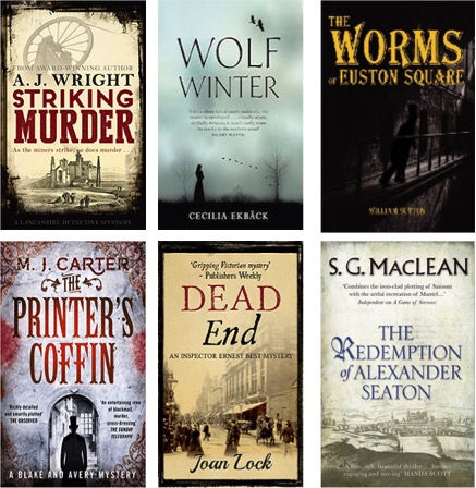
If you read historical crime, which of the six would make you pick a book up? And what turns you off in terms of covers?

Thanks Jude. You made an excellent choice for your album – I love the cover photo!
LikeLike
Ha ha!! It’s tricky! I had same issue with album cover. Carly gave me 12 options…..I put it to a vote!! Re your book covers-I’d opt for top right and top middle. Please don’t ask me why-in my case it’s just a visual thing. Good luck. Xx
LikeLike
Wolf Winter – probably because I like stuff that is more contemporary in style, moody atmospheric.
The Redemption of …. looks interesting and not sensationalised.
Others look a bit Victorian/melodramatic, but that may also be the titles.
Just the inclusion of the wheel in “striking murder” made me feel it might have a bit of technical industrial revolution stuff which could be tedious!
But be wary of my views as I do read historical fiction but am not particularly drawn to historical crime!
LikeLike
Mark, i know what you mean about Victorian/melodramatic – seems to be a common trope in Victorian crime covers.
LikeLike